RetailTechHoReCaAI ProductInsurTechNutrition & DietE-Commerce
Case tags
Team Leadership
HoReCa
Conversion
B2B
SaaS
8 June 2025
Eugene Kovpak
Senior UX/UI
kovpakeugene@gmail.com
or find me on
HomeWorkAboutTheater

ChoiceQr

The Essentials

At ChoiceQr, I led the design direction for a multifunctional HoReCa platform, managing a team of 4 designers across a 3-month product initiative to increase product conversion from 3% to 6%. We were focused on activation through registration, onboarding, and menu creation.

Team
Leadership

Led 4 designers
Differentiated roles in discovery, synthesis, and prototyping.
3 Months
Sprint Planning according to the Double Diamond.
Decision prioritization
Collaborative decision-making during the voting brainstorming sessions.

Key
Results

Primary Result
Activation success increased
from 3/8 to 7/8.
Validated in Usability testing
Secondary Result
Time for menu creation dropped
from 2 min. to 1.15 min.
Validated in Usability testing

Main
Decisions

CTA & Landing
The first pop-up should eliminate any confusing fields or data to avoid losing a client due to a misunderstanding.
Registration
It is crucial to always show progress in the registration process to retain users and stimulate them to finish it.
Team Leadership
A voting-based, and opinion-free workflow can be constructed only if there is a friendly-organized team.

My Role

Role: TeamLead
Period: 3 months
Team: 4 people
Responsibilities: Team leadership, design direction, research planning

Business Context

About

ChoiceQr is a B2B HoReCa SaaS platform that helps restaurants manage digital menus, reservations, CRM, delivery, and other operational tools in one ecosystem.

Business Goals

Primary Goal. Conversion
Increase conversion from 3% to 6%.
How: Improve the first-user journey (activation, onboarding, menu creation).
Activation Goal
Help new users reach first value faster.
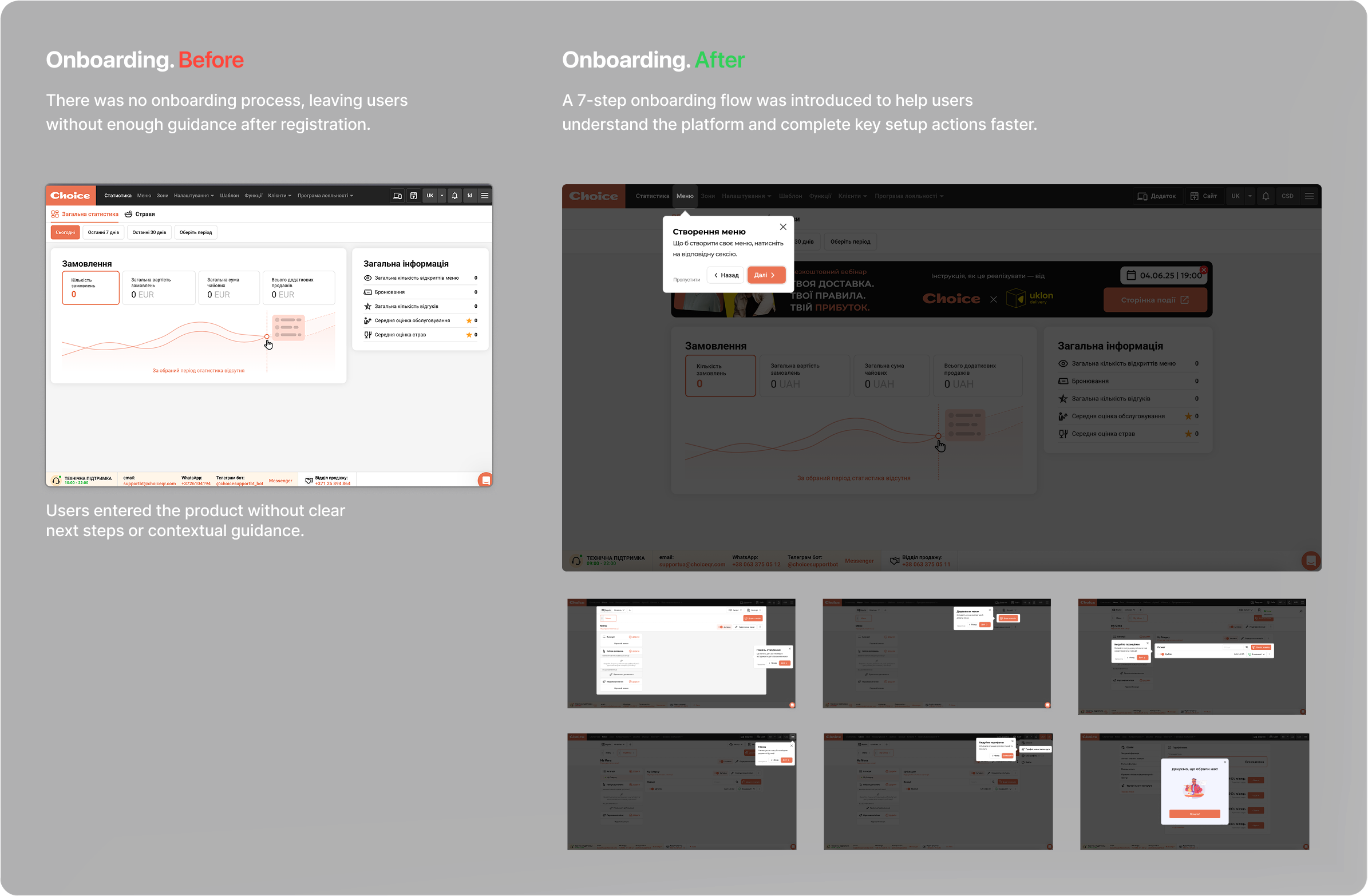
Onboarding Goal
Reduce early friction and uncertainty during onboarding.

Validated Problem

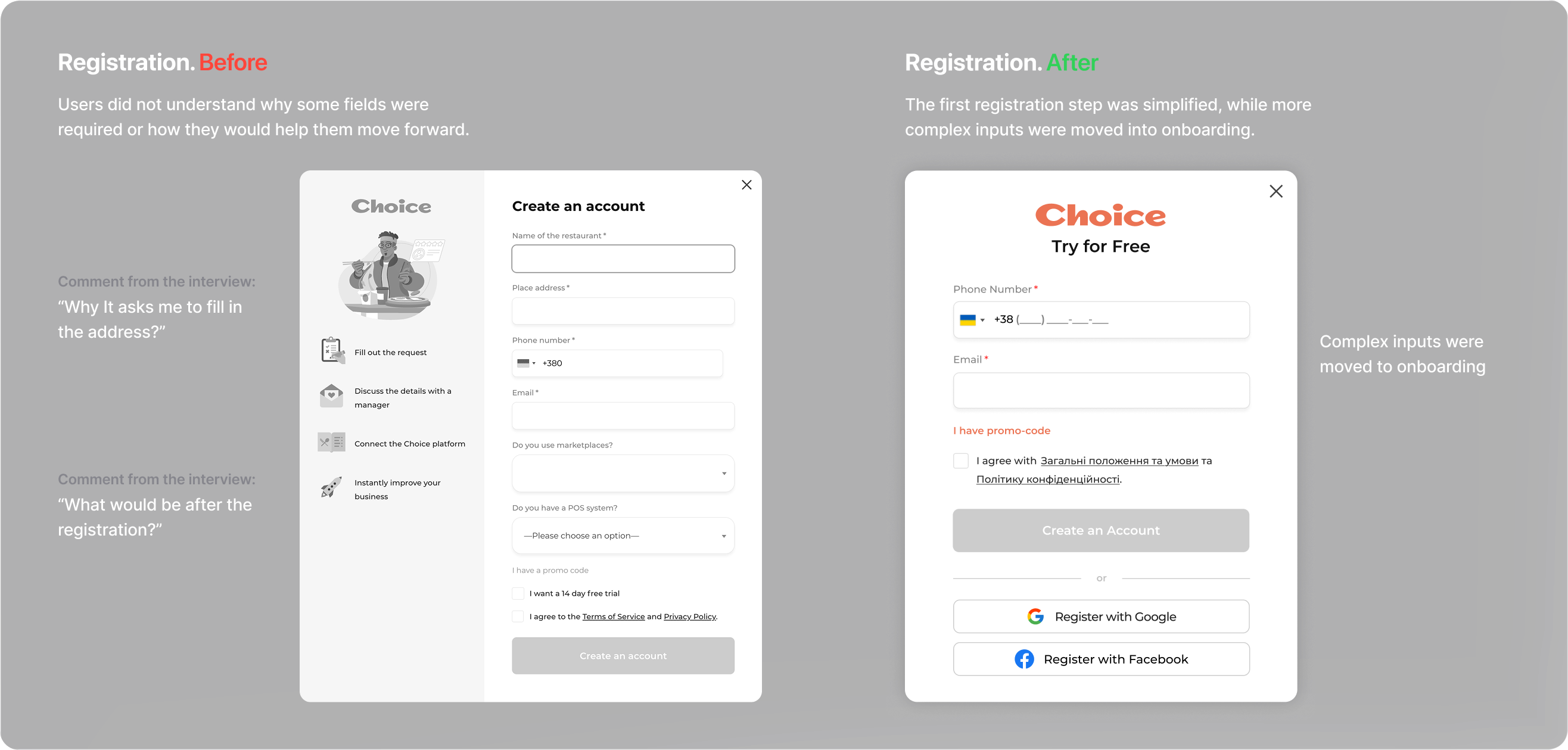
New and existing users do not always move smoothly from interest to activation. Friction across the landing page, registration flow, onboarding, and first menu creation weakens conversion and delays first value.
Validated through user interviews and usability testing

Decision One

Making the Primary Action Clear

To reduce friction and clarify what users will get after clicking the CTA.

Decision Two

Helping Users Understand Errors

To reduce drop-off when errors occur and help users fix issues faster.

Decision Three

Splitting Registration Into Two Phases

To reduce early friction by making the first registration step as simple as possible.

Decision Four

Creating a Dedicated Registration Flow

To reduce drop-off by showing users their progress and guiding them through registration step by step.

Decision Five

Supporting Activation With Optional Onboarding

To help users understand the product faster and reach first value with less friction.

Feedback

Team Leadership